I had quite a few problems during this scene, firstly the choice of scene right at the beginning of my project, and i had to change that which put me behind schedule, i also found out very late on that i wasnt able to use the character i wanted to otherwise i wouldnt get any animation done, which is still very dissappointing. I was also very annoyed by the amount of animation i got done in the end, it ended up being very short for the amount of time given for the project, this wwas mainly because of rediculous demands for other projects going on at the same time. I felt as if i had somewhat sacrificed this unit in order to make another one slightly better, which i regret having to do, but neither would have been completed if i would have balanced the two out fairly, and i feel as if having a team for the other project, outweighed this project, as there was always that added pressure of letting the team down.
I will definitly take knowledge from this experience, and i now know that scheduling is very important to a project, and i was somewhat bemused that we were only given a scheduling tutorial two weeks from the end of term, which confused me, and i still do not know why this was done, but i will be doing my uttermost to make a schedule in the first week of term for the projects next term.
I have found some very important lessons during this project, i know now that it is not nescessarily about knowing the software, it is more about coming to terms with an animation workflow and coming from designing, developing and creating a character to put into an initial idea and follow through to a finished piece. I have learned how critical it is to have a schedule to keep all these pieces into place, from the design problem to the solution which we create.
Wednesday, 10 February 2010
After Effects tweaking
I found that the lighting on my character was a little too sharp once i had exported him out of maya, so i decided to add an adjustment layer in After effects just to tweak the lighting the smallest amount to soften the light. I think this healped add a realism to the lighting and make it more comparible to the live action sequence.
Lighting
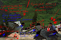
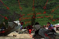
Lighting in this image shows the direction i interpreted the light coming from within a screen shot of my scene, it feels as if the lighting is coming from the foreground of the scene as the arrows show, and covering around the whole scene. there are no real areas of harsh contrast, except for those hilighted in blue, but i think those shadows are created from lights maybe a little higher up than the rest, pointing down on the scene, this is probably the sunlight. I am not sure if additional lights were added into this scene, or if they used direct sunlight, and post production to get the effect they wanted, however i am going to do my best to try to replicate the light effects we see.
The diorector has obviously thought well and hard about the type of lighting in the scene, he obviously has a story to tell and lighting can sometimes be pivotal to this, he wantes to create a very natural and soft look to the scene, as they are surrounded by a very natural area (beach and jungle) there can be room for contrast however with artifificial lights being added to strike that contrast, with burning objects from the plane crash seen in earlier scenes. It is important to thgink abotu what was going through the lighting directors head when creating this scene, as he has created this sort of lighting deliberately, and being able to understand the way he has done so, and why he has done so will allow me to interpret it far better and replicate it.
This image is obviously not what i am lookign for, the lighting is too harsh on one side of the characters face, and far too soft on the other, which is giving the character a defined shadow on one side of his head, i am looking for a more evenly spread light which comes from both sides of his head, as sunlight would, and maybe meets on the underside of his head with a shadow.

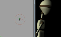
This image is a little better, but not by much i added another light ton the scene which seems to be enhancing light on the darker side of his head.
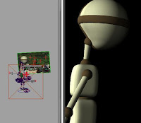
This is more the lighting i am looking for, his head is lit evenly from both sides, and there is some sort of shadow forming on the underside of his head, as is similar to the human characters in the scene, this is the lighting i will be using.
The diorector has obviously thought well and hard about the type of lighting in the scene, he obviously has a story to tell and lighting can sometimes be pivotal to this, he wantes to create a very natural and soft look to the scene, as they are surrounded by a very natural area (beach and jungle) there can be room for contrast however with artifificial lights being added to strike that contrast, with burning objects from the plane crash seen in earlier scenes. It is important to thgink abotu what was going through the lighting directors head when creating this scene, as he has created this sort of lighting deliberately, and being able to understand the way he has done so, and why he has done so will allow me to interpret it far better and replicate it.


This image is obviously not what i am lookign for, the lighting is too harsh on one side of the characters face, and far too soft on the other, which is giving the character a defined shadow on one side of his head, i am looking for a more evenly spread light which comes from both sides of his head, as sunlight would, and maybe meets on the underside of his head with a shadow.


This image is a little better, but not by much i added another light ton the scene which seems to be enhancing light on the darker side of his head.

This is more the lighting i am looking for, his head is lit evenly from both sides, and there is some sort of shadow forming on the underside of his head, as is similar to the human characters in the scene, this is the lighting i will be using.

UPDATE Changes and Compositing
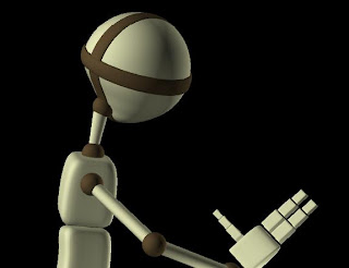
Afteer the opportunity fell through for me to use my own character and rig, i felt i neeeded to try something new to get the animation part of the project finished in time for the deadline. I decided to use a pre rigged charadcter called Bork, which on one level saddened me, and i felt i was somewhat 'cheating' as i was really looking forward to using my own character, however it also had its positives. I was able to get the full use of a professional rig, and that meant great deals of scope to have an improved animation. It meant that i may have been safrificing my modelling but i was gaining alot in what i could do in terms of animation which did not get me down too much.



Tracking my scene
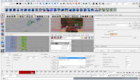
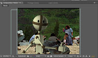
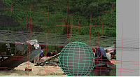
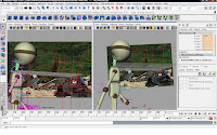
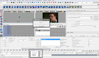
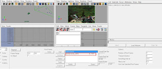
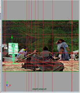
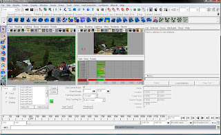
I used maya live to track my scene. I found the tutorial we were given to do this fairly easy to use, and i dindt have many problems with it until i came to solving my scene. I found out nthat i had set my scene up incorrectly in the first place, as i had uploaded all the image files in my scene rather than just the ones i needed to track, which gave me a massive pixel slip of something around 17, rather than the number under 2 that i was looking for. However i quickly learned from this error, and i used only the image files needed in tracking, and got a far greater result with a pixel slip of something around 0.8 which i went on to use for solving my tracking data. I created my cameraa with the data i had collected, and then went on to import my character that i was using for the animation. i put him inbetween camera and plane, and began to animate. I found it quite hard doing this so i decided to move the character away from the plane to animate out of the way of all of the distractions, and moved him back into place, switching from perspective view to my camera to see whether the animation aligned as i wanted it to.
It is a shame i wasnt able to use my washing machine character instead of a pre rigged character in this process, as i feel it would have looked a lot better.
Setting up my scene.
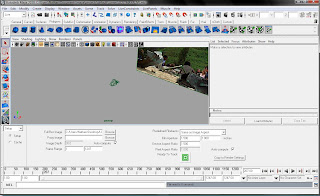
Camera tracking data created after it solved.
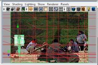
The camera newly created in perspective view

Character imported into camera view, ready to animate.
Modelling and rigging my character
Modelling and rigging my character
Here are the stages i went through in modelling and rigging the character i had designed. The design concept first came around when i was thinking about the first scene i chose, the tracking chase scene in the jungle which i had difficulties tracking. The noise the 'monster' makes in Lost, is a rattling, and mechanical sound which sounds very out of place within a jungle, so i thought i would put a twist on it when com,ing up for the design of my character and have him as a washing machine so that it would some way fit the sounds that are already in the live action. However now that i have scrapped that scene, i think i will still be abel to use my character, as he couyld just look like an inconspicuous piece of debris walking across the scene after the plane crash. I think this would put a funny twist on the actual serious nature of the drama which is occuring in the episode.
Is tarted out with a few sketches of a washing machine and then went on to use them to model a character in Maya. I wanted him to look cartoon-like whilst still having a somewhat human feel, so i gave him arms and legs. And to add a comedy aspect to the character, i gave him random flip flops, as he is on a beach, and maybe there to go swimming?
I want to put accross the character not as being evil, but as being quite a funny character, and the chase scene may have done the opposite for that, giving the character a position of heirachal power and frightening the lives out fo the characters running from it on screen. This new scene i have found has given me a lot of potential to create an opposite effect, and allowing the character to be portrayed very differently. My character first come from my imagination, and i feel from there it is important to develop a character persona, this is important in establishing a connection between it and the audience, and the way he is viewed by them. Colour and appeareance can play a pivotal role in this, i have chosen bright soft colours to emphasise its friendly nature, although the bright yellow flip flops give it a spark of flair and maybe make the character a little 'nutty'.
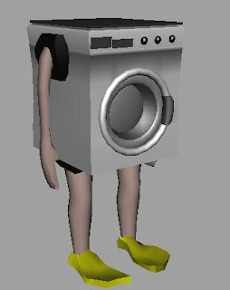
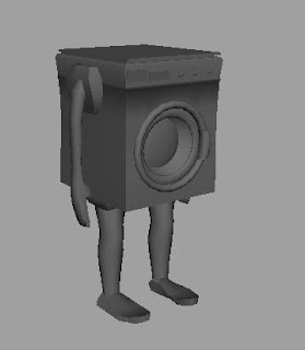
I am fairly pleased with the way this model turned out, as it was my first ever time modelling a character. I went on to texture the character to look as much like a washing machine as i could, and gave him human coloured arms and legs.
Rigging
I went on to try to rig my character, however this gave me some problems, after asking many times for help, i couldnt use the tutorial i was given to any effect to try to get the movement i wanted in my charater. As i have had no previous rigging experience, and didnt have much time to learn, due to other commitments in other projects, i felt like i neglected this project somewhat and maybe in the future i will learn how to rig so i do not come across this problem again.
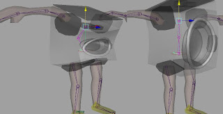
I did my best in trying to create a skeleton inside my washing machine and i got some of the desired effects i wanted. I got the arms and Legs working well on IK handles, and i got a nice bend in the torso area of the washing machine, but when it came to actually animating the character, it wouldnt move as i wanted, and it was the fine turning that i needed help with and didnt really know where to get it as whenever i asked i was told to look at tutorials, which only told me what i already knew. Some of the pictures below show the movement i was able to get out of the rig and the way that i built it. I am fairly certain that i am capiable of expanding my knowledge of rigging in the future, although i do not enjoy it one bit. However i feel it is a nescessary part of the animation course.
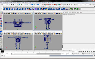
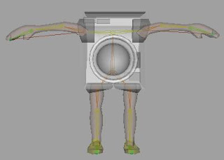
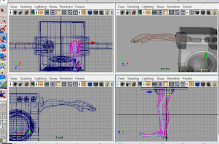
Here are the stages i went through in modelling and rigging the character i had designed. The design concept first came around when i was thinking about the first scene i chose, the tracking chase scene in the jungle which i had difficulties tracking. The noise the 'monster' makes in Lost, is a rattling, and mechanical sound which sounds very out of place within a jungle, so i thought i would put a twist on it when com,ing up for the design of my character and have him as a washing machine so that it would some way fit the sounds that are already in the live action. However now that i have scrapped that scene, i think i will still be abel to use my character, as he couyld just look like an inconspicuous piece of debris walking across the scene after the plane crash. I think this would put a funny twist on the actual serious nature of the drama which is occuring in the episode.
Is tarted out with a few sketches of a washing machine and then went on to use them to model a character in Maya. I wanted him to look cartoon-like whilst still having a somewhat human feel, so i gave him arms and legs. And to add a comedy aspect to the character, i gave him random flip flops, as he is on a beach, and maybe there to go swimming?
I want to put accross the character not as being evil, but as being quite a funny character, and the chase scene may have done the opposite for that, giving the character a position of heirachal power and frightening the lives out fo the characters running from it on screen. This new scene i have found has given me a lot of potential to create an opposite effect, and allowing the character to be portrayed very differently. My character first come from my imagination, and i feel from there it is important to develop a character persona, this is important in establishing a connection between it and the audience, and the way he is viewed by them. Colour and appeareance can play a pivotal role in this, i have chosen bright soft colours to emphasise its friendly nature, although the bright yellow flip flops give it a spark of flair and maybe make the character a little 'nutty'.


I am fairly pleased with the way this model turned out, as it was my first ever time modelling a character. I went on to texture the character to look as much like a washing machine as i could, and gave him human coloured arms and legs.
Rigging
I went on to try to rig my character, however this gave me some problems, after asking many times for help, i couldnt use the tutorial i was given to any effect to try to get the movement i wanted in my charater. As i have had no previous rigging experience, and didnt have much time to learn, due to other commitments in other projects, i felt like i neglected this project somewhat and maybe in the future i will learn how to rig so i do not come across this problem again.
I did my best in trying to create a skeleton inside my washing machine and i got some of the desired effects i wanted. I got the arms and Legs working well on IK handles, and i got a nice bend in the torso area of the washing machine, but when it came to actually animating the character, it wouldnt move as i wanted, and it was the fine turning that i needed help with and didnt really know where to get it as whenever i asked i was told to look at tutorials, which only told me what i already knew. Some of the pictures below show the movement i was able to get out of the rig and the way that i built it. I am fairly certain that i am capiable of expanding my knowledge of rigging in the future, although i do not enjoy it one bit. However i feel it is a nescessary part of the animation course.


Storyboard
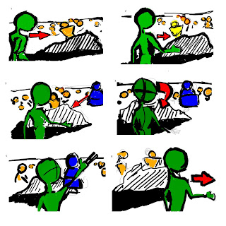
This is the storyboard for my proposed scene. The green character is my 3D aspect, the blue is Hurley and the yellow are random bystanders. The scene tracks across the beach so the idea is to have to character in 3d being tracked with the camera, so he wont nescessarily move in a forward direction, but will instead be tracked with the camera movement giving the illusion that he is standing and walking on the spot if you was to take away the live action sequence. The camera follows the character and as he approaches the end of the Rock in the foreground he quickly turns his head to face the camera, and then back around 180 degrees to fadce Hurley, and then raises an arm to wave to him, and then walks off. I feel that this scene will work well and will enable me to have some good interaction animation between the live action character and my own character. The plan is to keep the washing machine character i have designed with intention in using in my earlier chosen scene as he will fit in with the debris on the beach and will look rather funny walking along while he should be a part of the debris.
Subscribe to:
Posts (Atom)